Better web application interface markup: lessons from theme frameworks
Every time I start a new web application project, I spend a while (re)thinking what the layout structure should be in terms of CSS and HTML (e.g. semantic naming, organizing CSS markup).
Recently, I did a project using the Thematic theme framework for Wordpress, and that got me thinking about how custom web applications interfaces could be improved. As an individual developer, I rarely have the luxury of focusing on the details of the layout. In contrast, the developers building theme frameworks have spent years thinking about how to create a generic, extensible structure for web application interfaces.
I had a look at Thematic, WP-Framework and Theme Hybrid (see more frameworks in this Smashing Magazine article). I used Thematic, since I ended up using it in the Wordpress project I did. Here is how Thematic does it's HTML layout:
An overview of the HTML code (based on Thematic)
I think the most interest parts of Thematic for web application design are the HTML structure, use of ids and classes and the CSS files. The hook-and-filter system (overview here) is less interesting from the web application point of view, since you will most likely be writing all of the code from scratch for your own web applications.
<!doctype html>
<html>
   <head>
      <title></title>
      <meta http-equiv="Content-Type" content="text/html; charset=UTF-8">
   </head>
   <body>
      <div id="wrapper">
         <!-- Header -->
         <div id="header">
            <div id="branding">
               <div id="blog-title"><span>...</span></div>
            </div>
            <div id="access">
               <div class="menu">
                  <ul>...</ul>
               </div>
            </div>
         </div>
         <!-- Main -->
         <div id="main">
            <div id="container">
               <div id="content">
                  <div>...</div>
               </div>
            </div>
            <div id="primary">
               <ul>...</ul>
            </div>
         </div>
         <!-- Footer -->
         <div id="footer">
            <div id="siteinfo">...</div>
         </div>
      </div>
   </body>
</html>
1. Body and wrapper
In all of the frameworks, the body classes contain various information such as the platform (windows) and the browser (firefox, ff3).
Benefits: Easier to specify per-browser css fixes (if needed). This makes it easier to make adjustments based on the browser or OS used in CSS, eg. ".windows xxx.yyy { ... }".
Separation between body and content wrapper. In the framework, the content is wrapped in a wrapper layer (id=wrapper), so that the body has only one child element. I would imagine this is to make it easier to use CSS to adjust the padding and background of the pages.
2. Heading
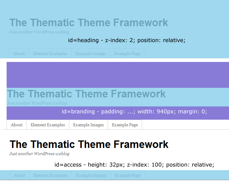
The heading consists of two sub-divs, as shown below:
There are only three subelements to the content wrapper: heading, main and footer. Each of these divs is full-size and positioned relatively.
Benefits: Easy to add repeating backgrounds. One can easily apply a CSS background-image to create a repeating and consistent heading.
Easy positioning of the elements. The heading consist of the branding and access divs. This makes it easy to add new heading elements in the branding, while keeping the menu (=access div) separate, with it's own background.
Standard menu HTML. All of the frameworks appear to be using the Superfish menu by default, which is based on jQuery.
3. Main content
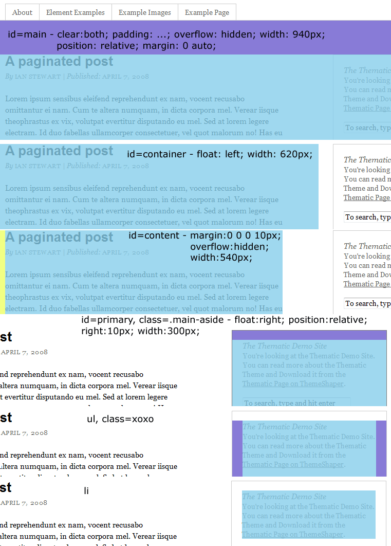
The main content consists of a container with a content-sub-div and a primary sidebar:
The main content div has a fixed size. This is then subdivided into two divs, container (for the content) and primary (for the primary menu block).
Benefits: Semantic markup; floats to reposition Having these separate divs means that switching from "menu on the right" to menu on the left is simple, since one can change the CSS float directions to reverse the positions of the subcontainers. Easy to add new content areas One could also add more subdiv for additional content areas, and create multiple columns relatively easily by positioning the subdivs within the main content div. Easy to add sub-items The primary menu is a div, with each block having its own unordered list (ul). In practice, this leads to two levels of lists - one for the item blocks themselves, the other for the sub-items (e.g. the links in a Archives block).
4. Footer
The footer consists of a single subdiv:
Again, the top-level div only specifies the margin, while the inner divs are positioned within it. This makes it easy to add a background to the footer div.
Does this work?
I'm currently using this approach in recent two web applications I built. The markup seems a lot cleaner, more standard and I have found that re-theming the same basic HTML is much nicer than reinventing the wheel. In short, I think this is a good approach. Let me know if you have improvements via a comment.
Somewhat related: What about other techniques, such as CSS Grid frameworks or Haml/Sass?
I'm not yet convinced that I need to use a CSS Grid framework (e.g. Stackoverflow discussion).
As for Haml, I'm pretty sure that I am fine with regular HTML without any syntactic sugar.
Sass seems to be a real improvement over CSS (variables, nesting, mixins etc.), but on the other hand I haven't had the time to set it up with my non-Ruby environment.


