Syntax highlighting / color schemes for Netbeans
There are two important things to try out in picking the IDE settings that work best for you: 1) the font you use and 2) the color scheme for syntax highlighting.
Choice of font
My font of choice is Consolas (included in Vista/Win7 and available for download). It looks awesome with ClearType and the zero character is different from the letter O. My second choice is Bitstream Vera Sans Mono, which is free and widely available.
The Code Project has a great compilation of the 42 best programming fonts.
Choice of color
The basic choice is between a dark background and a light background. Full contrast schemes are considered more hard to read, which means that slightly off-white or off-black backgrounds are easier to read.
Personally, I prefer white or off-white with dark text. Jeff Atwood did some background reading into this and quotes from a study that "When light text is placed on a dark background the text may seem to glow and become blurred; this is referred to as halation, and it may make the text harder to read." Subjectively, I find white text on dark backgrounds to be a bit uncomfortable.
"If everything is important, then nothing is important". This was mentioned in Garret Dimon's Application Interface Design presentation, and I think it is a good point: Don't highlight every syntactically different part of the code with sharp colors, just the stuff that matters the most. For me, these would be the keywords, variables and class names.
Hence I changed comments to be de-emphasized (gray) as well as any HTML tags (which are less important than the code in views). I am experimenting with a off-white background to slightly reduce contrast and eyestrain.
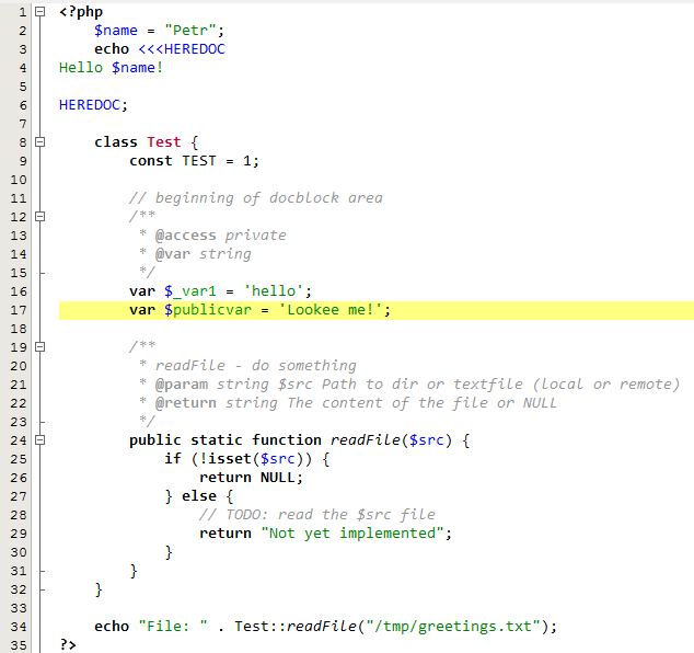
My light color scheme (Netbeans, Textmate and Sublime Text):
See what my color scheme looks like at the bottom of the post. You can download the updated version for NetBeans version here: includes minor tweaks, such as changing the semi-comma character to light gray.
NEW! Also available for Textmate/Sublime Text here. Unzip, open "Browse Packages" from Sublime Text, go to the "User" folder and copy the thTheme files there.
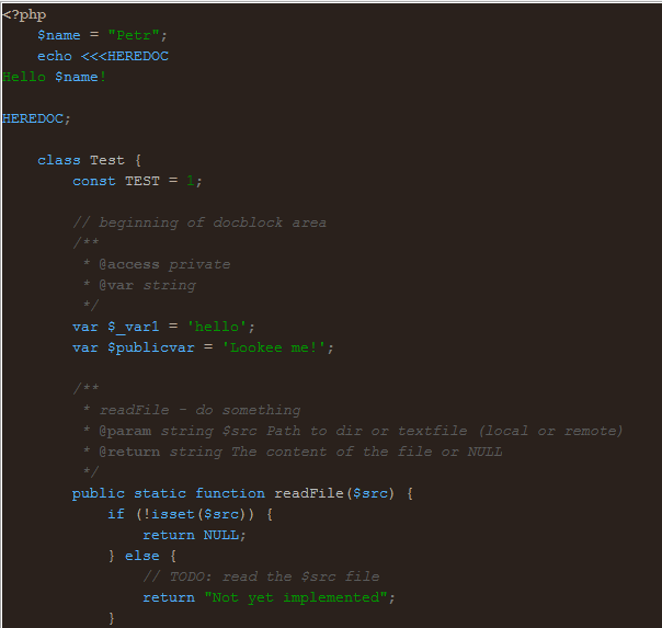
My dark color scheme (NEW!):
I've also started to use a dark color scheme inspired by the Espresso Libre scheme for Sublime Text 2. See what my color scheme looks like at the bottom of the post. You can download it for NetBeans here.
NEW! Also available for Textmate/Sublime Text here. Unzip, open "Browse Packages" from Sublime Text, go to the "User" folder and copy the thTheme files there.
The color scheme uses very few colors as I find having many colors distracting.
More color schemes:
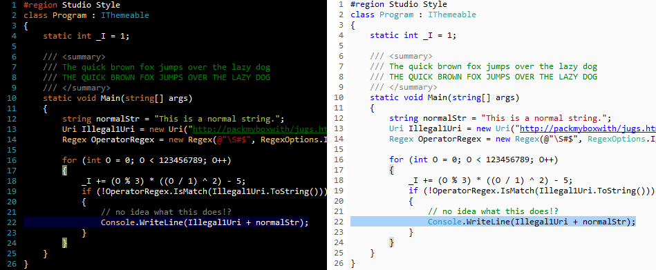
Whether or not you use Visual Studio (I use Netbeans), go check out the great gallery of syntax coloring schemes at studiostyles. They have dozens of user-submitted color schemes and alternatives which you can use as a basis for configuring your own IDE.
My light color scheme
My dark color scheme:
Comments
moondowner: Searching for color schemes for NetBeans I found yours, just to say that I really like it!
nobita: great work ! it's useful . Thank you :)
Anders: Hi.
About espresso libre: Now that is a dark scheme that I can actually use for longer than some minutes. Love the blue keywords.
Noticed, that since I'm working with Java now, there is a "Mark occurrances" that when using the default background (236, 235, 163) doesn't work very well with the bright foreground color of e.g. methods. Giving this a dark gray foreground color, like (102,102,102) helped a lot, though.
Mikito Takada: Thanks! The original Espresso Libre is actually a bit more colorful: http://inkdeep.github.com/TextMate-Themes/images/espresso_libre.png
I like the background but I find more than 2-3 colors distracting, which is why I wrote my version.
Anders: Yes, I put my words down slightly wrong. I was addressing your version of course; a bit more pleasing to the eyes than the original.
Ian: Excellent work, I've started using the mixu_expresso for netbeans.


